Need user insight? Get the Playbook 📕
Congratulations! We've made it to the implementation phase. That's no small task. By adhering to a standard user experience (UX) research process, we've successfully navigated how to analyze UX research data for insights, followed by how to succeed in User Insight Storytelling. Now, we've got a spreadsheet full of user experience recommendations, and we're ready to arrange them, so that stakeholders have a clear sense of priority. Let's get to it.
Now, what? That's the question we're asking ourselves, and being asked of by others. In this article, we'll detail several ways to prioritize recommendations from UX research. We'll help you move from a basic list of rec's to a well-organized set of next best actions with a clear indication of relative importance.
Work smarter, not harder.
The Turbo UXR Playbook is your tactical reference 👇 guide — free to download!
Get the Playbook
Learn More
Follow us on our journey of UXR implementation as we discuss where recommendations come from, why it's important to prioritize them, 5 tried-and-true best practices of doing so, along with free templates to facilitate the process.
Buckle up, it's time to buckle down 🤓 on our UXR recommendations.
user experience recommendations uxr implementation data-led user insights action-oriented recommendations recommendation hierarchy user journey map forced ranking system research system data validation uxr-Ops conditional formatting dev support experience mapping ux enhancements
In order to formulate UX recommendations, one must undergo a variety of tasks. We do not recommend jumping to conclusions when it comes to creating recommendations. Any ol' person can decide they know what's best and offer their personal feedback about a product experience. However, what separates UX researchers is that we leverage a variety of objective user data to develop key insights, opportunities, and actionable recommendations. We let the data 📊 decide what's needed most by/for users.
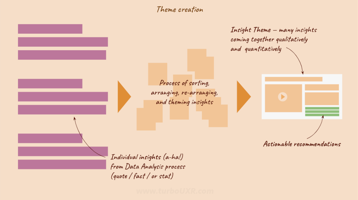
A structured approach is the best way to generate UX recommendations for Product. You'll begin by amassing user data, upon which you can perform a thorough data analysis. By using frameworks to analyze user data, key insights will emerge. These insights are the lifeblood of the process. By finding common themes and grouping insights, you'll transition into creating compelling Insight Themes. And from these clear, evidence-based themes, you'll establish UX recommendations.
User data analysis (Huh?) → insight theme creation (What?) → actionable recommendations (So, what?) → prioritized recommendations (Now, what?)
Every insight theme created for your project should contain 3–5 associated recommendations. And they ought to be actionable. An example of an actionable recommendation might look like, 'Do [X]', 'Change [Y]', or 'Consider [Z]'. Effectively, we're developing the 'So, what?' part of our story with actionable recommendations. This paves the way for, 'Now, what?'... the 👉 prioritized UX recommendations.
Work smarter, not harder.
The Turbo UXR Playbook is your tactical reference 👇 guide — free to download!
Get the Playbook
Learn More
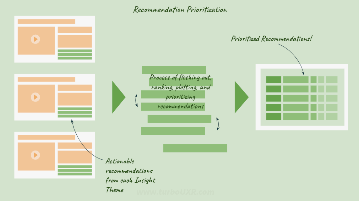
UX recommendations are important to prioritize because doing so demonstrates leadership and pragmatism. Following through in this manner improves product adoption, and increases likelihood of action. And action is our goal as UX researchers. We exist to instigate positive change in the user experience. Prioritized recommendations make it clear as day for stakeholders which actions are most important to tackle 1st, 2nd, 3rd, etc.
Stakeholders tend to have many things happening concurrently within any one project, so it can be hard for them to devote full attention to your UXR share out. Moreover, they might be juggling various other projects at differing stages. Needless to say, they're swamped. Drained. Not fully listening 👂.
Therefore, the process of Recommendation Prioritization makes things stupid simple. Of everything learned, summarized, shared, etc. you'll have the top-5,4,3,2,1 things for which you recommend Product to solve... ASAP. Note: If nothing else, it will prompt a meaningful discussion about what everyone believes is the most important, if not what you suggest.
In the following section, we'll give you some tools and techniques for how to prioritize recommendations. It's time to move from simply having UX recommendations, to having a clear hierarchy of normalized and vetted UX recommendations.
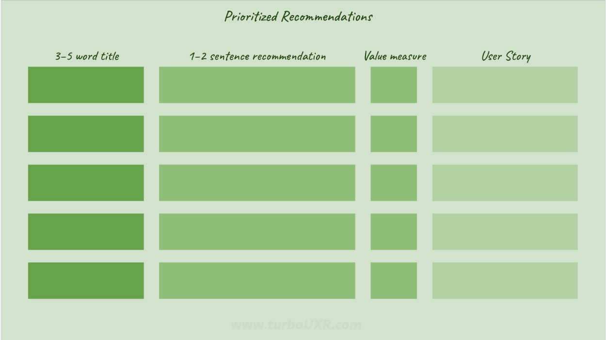
The first step, no matter which framework chosen, is to normalize the recommendations. Pull out all your recommendations from your insight storytelling deck and put into a spreadsheet. Further clean ✨ them up as needed, give each a 3–5 word title that summarizes the recommendation in an abbreviated fashion, clearly write out the recommendation details in 1–2 sentences, and notate for which User Story it solves. Leave the 'value measure' blank for now, as it will be filled in by the process to come.
Once this foundational process is complete, we're ready to prioritize the recommendations using one of the following methods:
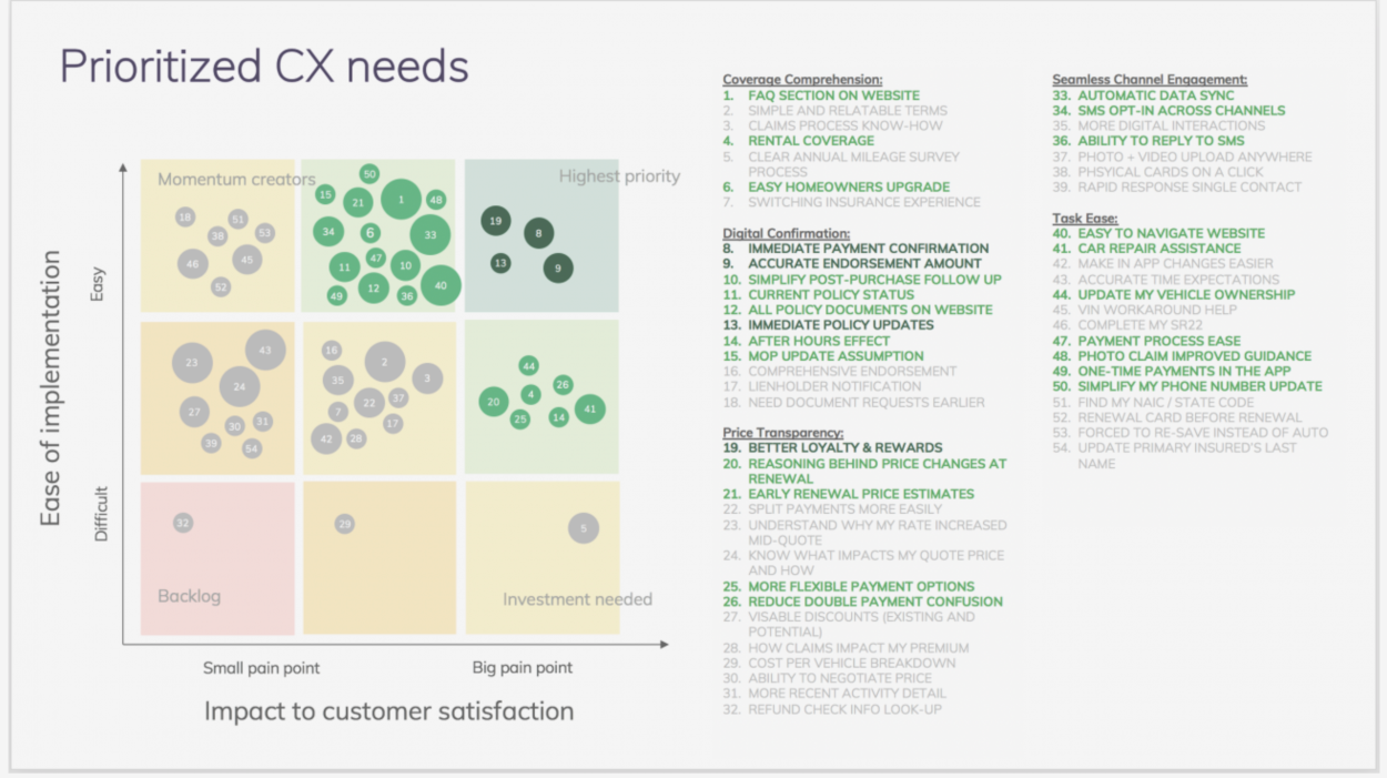
Impact x Ease matrix is a form of differentiation analysis. Effectively, you're simultaneously plotting the UX recommendations along a horizontal and vertical axis, assessing relative positioning. The horizontal axis is the spectrum that illustrates the potential for impact to the user experience — from small user pain point to large pain point for which the UX recommendation solves. While the vertical axis lays out the spectrum of ease of implementation — from easy to difficult to implement by internal standards.
By plotting the UX recommendations on a visual matrix, you'll create a graphical representation of relative importance. For example, a recommendation that's difficult to implement and solves for a small user pain point will not top the list. While, a recommendation that's easy to implement while solving for a major user pain point 💊 will rank highly.
Tips for using the Impact x Ease matrix: (1) Consider alternative spectrums, (2) utilize dot sizing for a third perspective, and (3) scrutinize each decision. First, if Impact x Ease doesn't work for your situation, then swap out the spectrums for something more useful (e.g. alternative business metrics: revenue potential, cost-savings, margin influence... and additional user impacts: likelihood to recommend, call obviation, lifetime value influence, etc.). Second, if you need more information visualized, consider utilizing a S/M/L dot plot. This gives an additional layer of information to further assist in decision-making. Third, avoid putting everything in one or two quadrants. Think through the relative positioning of each UX recommendation to ensure wide-spread mapping.
Return to overview ⤴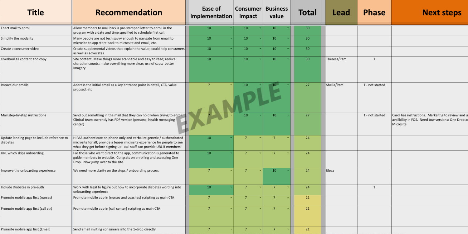
With the Forced Rank prioritization method, you'll simply leverage a new spreadsheet or tab to conduct the analysis. In general, it's best for those who are less visual and more analytical (show me the numbers!). Choose 3–5 variables (e.g. business value, consumer impact, ease of implementation, etc.). Assign each UX recommendation a numerical value to indicate low vs. high. Then sum up all the column values to obtain the total for each recommendation. Sort / order by the sum-total to showcase the most influential UX recommendations.
By assigning individual numerical values to key variables (then totaling), you'll more objectively delineate among recommendations. The process naturally surfaces the most valuable UX recommendations. More importantly, it will temper your subjective attachment to specific choices. This is because you'll be blind to the total score until the end, allowing you to focus on the individual criteria of each recommendation, and letting the spreadsheet do the final 🏁 decision making.
Tips for using Forced Rank analysis: Use 1, 3, 7, 10 for the numerical options to create more distance between low-value and high-value recommendations, and to more clearly highlight winners. Furthermore, use Conditional Formatting to color code the variable cells (e.g. 1 = red, 3 = orange, 7 = yellow, 10 = green), which helps to create visual hotspots when completed. Lastly, use Data Validation to increase teamwork by forcing all stakeholders to adhere to same scoring process, allowing for multiple people to score / submit, and the easy weighing of averages.
Return to overview ⤴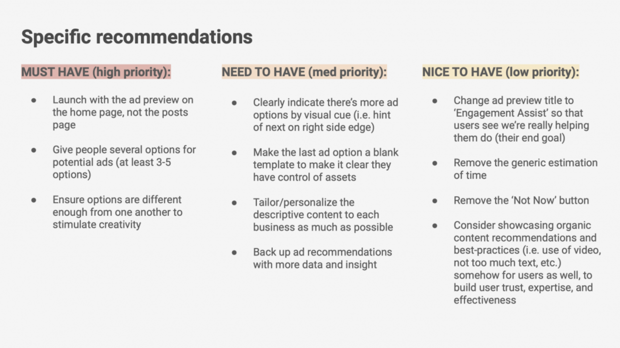
When strapped for time (like, every project), it's best to use the Haves and Have-nots prioritization method. It's simple. It's fast. It's a great first step, that allows for additional layering of priorities, if needed (see the next 2 methods). Begin by creating 3 buckets: Must-have, Need-to-have, and Nice-to-have. Then, sort each of your UX recommendations into 1 of the 3 buckets. No overlap. No duplications.
By categorizing UX recommendations into Must-have, Need-to-have, and Nice-to-have buckets, you'll focus attention towards what really matters most. This is helpful for both product stakeholders and you as the UXRr, because it allows you to reconsider your presentation of recommendations. For example, you may decide to gear ⚙️ more time towards the must-have's if the project is evaluative in nature, or towards need/nice-to-have recommendations if the team is seeking longer-term competitive advantages.
Tips for using Haves and have-nots: Be critical when deciding on each bucket. Not everything will be a Must-have. Intuitively weigh variables around business impact, user value, development effort, etc. to determine recommendation positioning.
Return to overview ⤴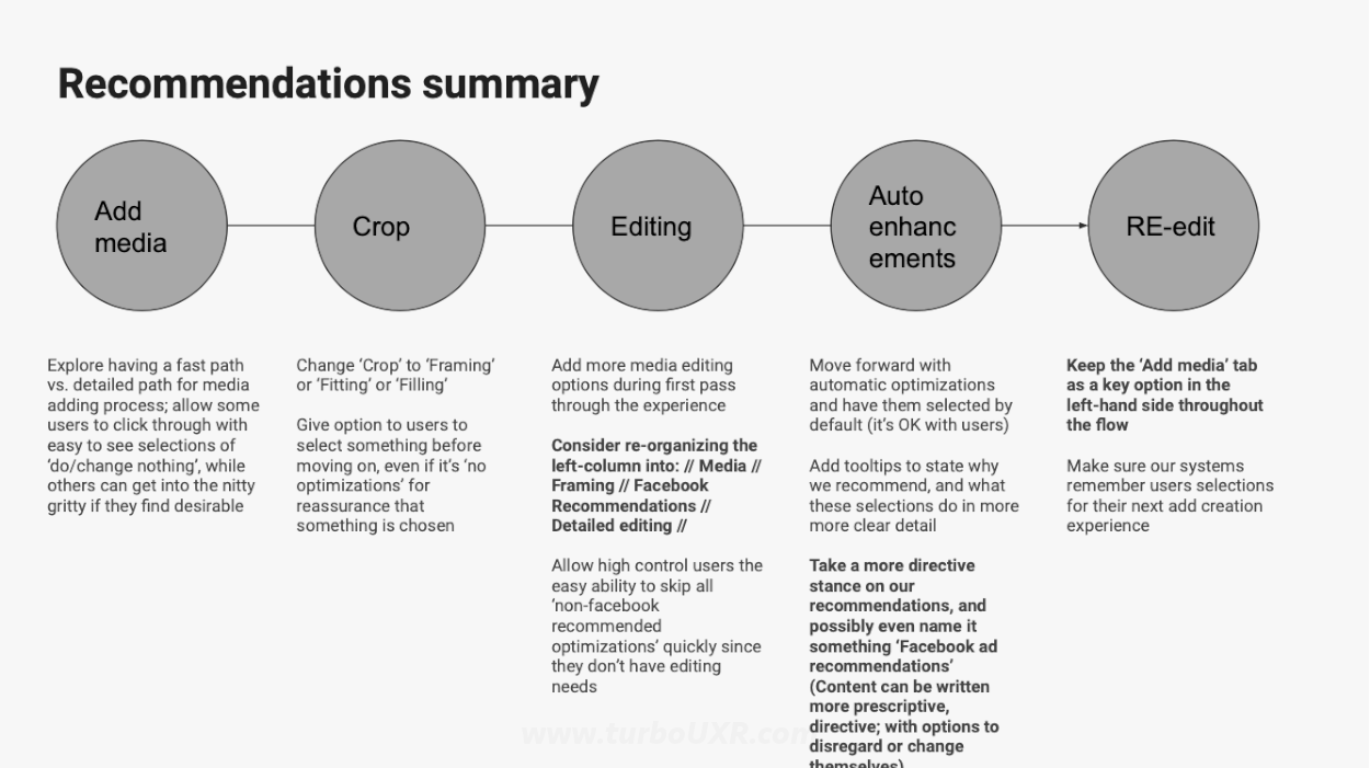
Experience Touchpoint plotting is a great quick-and-dirty way to pull UX recommendations apart and put them into context. To start, simply place all the UX recommendations on a UX journey map. If desired, this can be combined with method-3 (Haves / Have-nots) for ranking in addition to plotting along the user journey. Either way, a basic user journey typically does the trick for illustrating where in the experience recommendations can have an impact. More detailed user journey maps are a nice-to-have, when the project and time allows.
By laying out UX recommendations on a user experience map, it helps others understand where in the UX journey improvements might occur. This is helpful for making your UX recommendations more digestible. For example, perhaps there's a portion of the user experience that is more-or-less off limits, due to technology limitations, outside influences, etc. This method guides stakeholders to focus on where they can/want to impact the UX most. Additionally, you can visually see where more/less improvements need to happen on the map 🗺️, which is useful insight in itself.
Tips for using Experience Touchpoint plotting: Along with UX recommendations, consider showcasing user pain points, opportunities, and insights. This whole picture makes for a great deliverable. Extra points for partnering with design to illustrate future-state experience or prototypes of what it would/could look like, if solved! Lastly, indicate recommendation hierarchy within each touchpoint by using some visual mechanism (e.g bolding, coloring, ordering, etc.).
Return to overview ⤴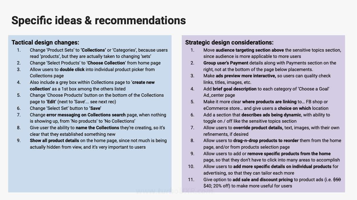
At the very least, you can prioritize UX recommendations into a Strategic vs. Tactical comparative table. We know it took a lot of work just to get to the recommendations (you're probably tired), but for the sake of your stakeholders, at least do this mental work for them in advance. Establish 2 main categories on a presentation slide, and systematically move your recommendations into one of the respective buckets. It won't take long, but it's a great first step to understanding relative importance.
By grouping UX recommendations by either strategic or tactical, you'll help stakeholders understand broad implications at a glance. This might not be everything they need to move forward, but it gets the ball ⚽ rolling. You can then discuss which area is more in scope. Strategic recommendations would mean focusing on bigger/badder opportunities, even if the cost/time/energy is higher. Whereas, tactical recommendations will more often yield immediate improvements that "keep the lights on", while ignoring some of the heavier lifts (for better or worse).
Tips for using Strategic vs. Tactical: Not much to add here, except you can merge this categorization with method-3 (Haves / Have nots) or method-4 (touchpoint mapping) to bolster your prioritization effort. Doing so adds additional dimension to the prioritization output.
Return to overview ⤴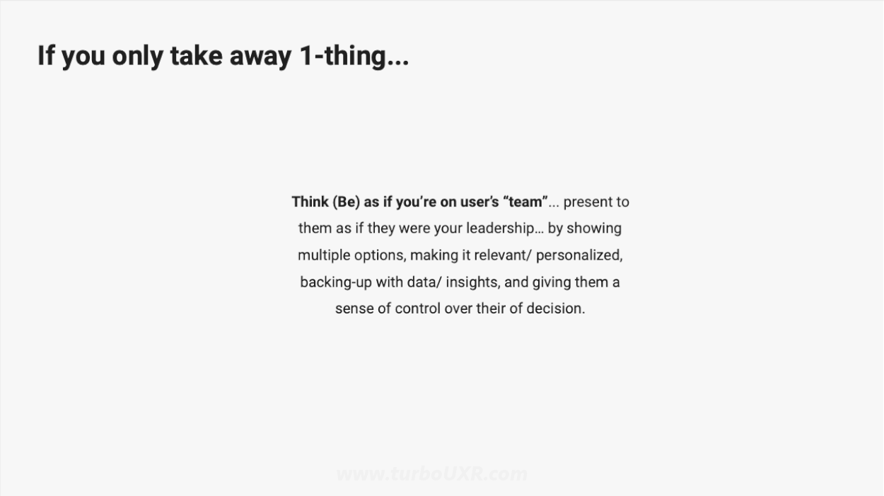
OK, so you've done all this UX research, and your stakeholders are short on patience/time/interest. Well, with this last bonus prioritization framework, we've got your hail mary shot covered. 'If you only do 1-thing...' DO THIS! A supreme way to prioritize your UX recommendations down into one single, most important action. Of everything you've learned, what's 1-thing that 100% needs to improve. Determine it. Say it. Own it.
By communicating the single most important thing that Product needs to change as a result of user research, you'll make sure something sticks. Consider it a snowball ❄️ effect. If you get stakeholders to see/act upon this 1st main opportunity, then — in time — you can show them what's best to tackle 2nd. And 3rd. And so on. You're assisting the baby in taking its first steps, knowing it will soon be running, requiring additional hand-holding.
Tips for using 'If you only do 1-thing...': Of all your UX recommendations, surface the most important one. Alternatively, the statement can act as a summary of a small batch of related recommendations. Combine a few interdependent recommendations into a single pointed, yet comprehensive statement.
Return to overview ⤴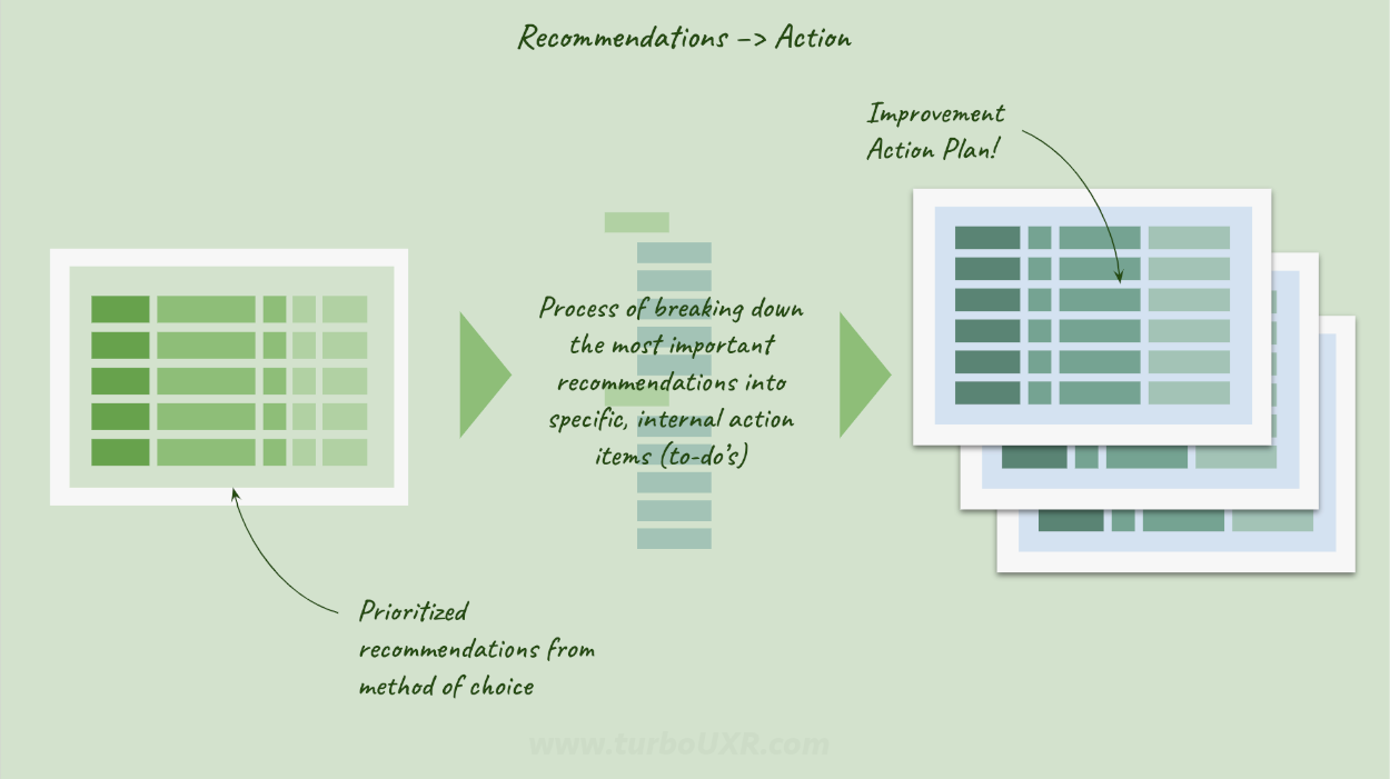
Prioritized recommendations are a vital step to implementing user experience enhancements. Once fully detailed, measured, and surfaced, recommendations can be taken to the next level. And that level is all about the creating UX Improvement Action Plans.
In our next article, 4 Components of an Improvement Action Plan 🎬 we'll detail what this planning process is all about. To briefly describe, recommendations can be looked at like tactical goals. They set the direction for the necessary work to be done. The Action Plan is all about breaking down those UX goals into tangible, measurable to-do's for the organization. In other words, the art of 'getting sh*t done' in an organization for betterment of the user experience (no small task).
See our article on how to create UX improvement plans based on user research, to learn more about what's next.
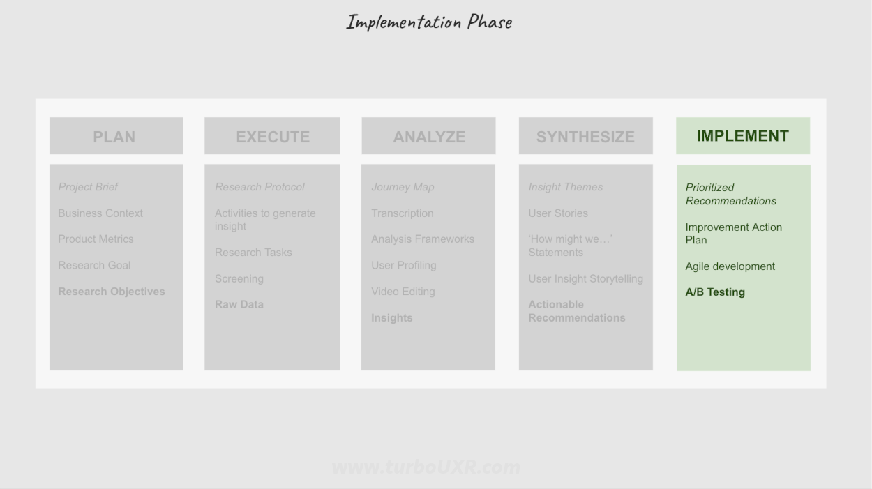
The process of prioritizing UX recommendations exists within the Implementation phase of a UXR project. As we just learned, the Implementation phase is all about forward action.
However, Plan, Execute, Analysis, and Synthesis are all necessary steps to achieve successful implementation of UXR recommendations. You can't get to prioritized UXR recommendations without the prerequisite user data, insights, themes, and actionable recommendations. So, take a look at how the Prioritized Recommendations process functions amongst the greater research system of operations.
See our End-to-end UX Research Project Guide to learn more about the additional phases that prelude Implementation.
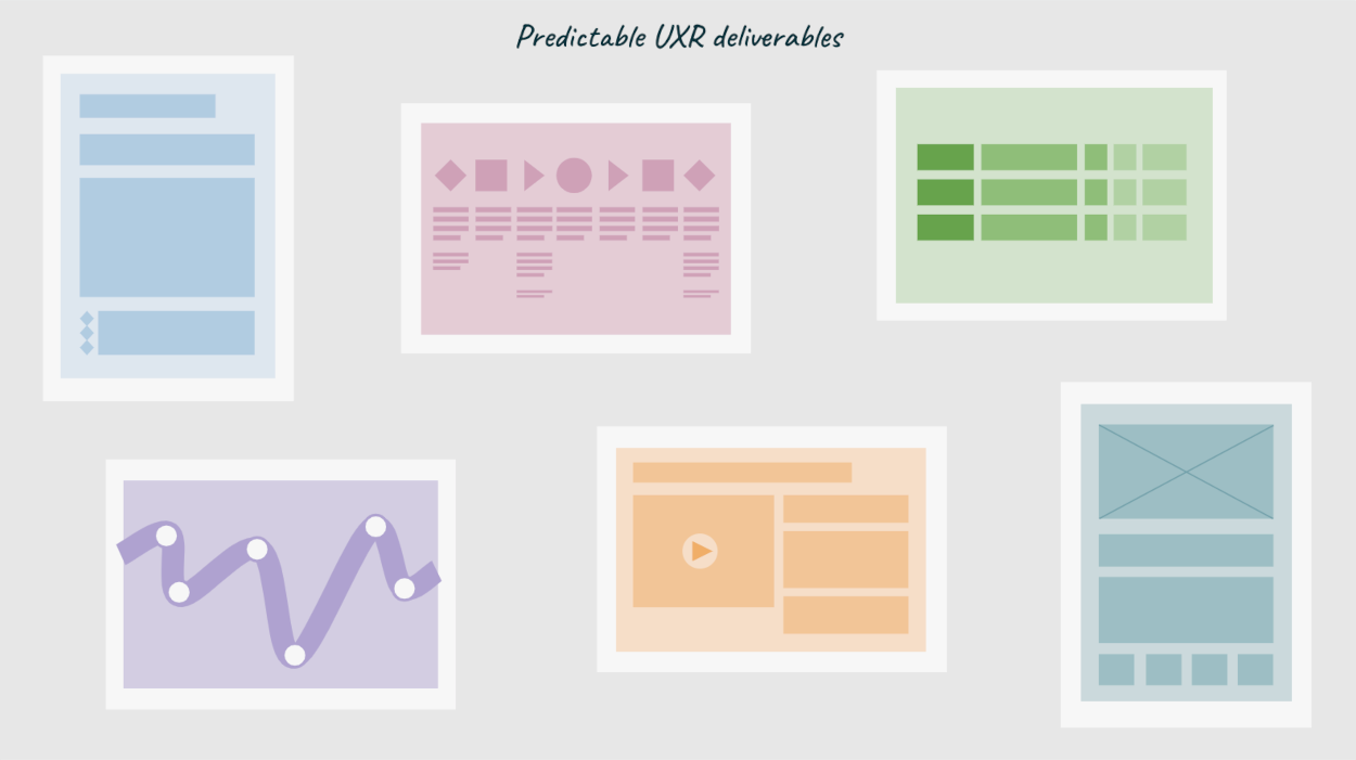
Need help getting started? Check out our online repository of user experience research templates. This UXR toolbox has specific templates for all phases of a UX research project. Examples include a UXR project brief template to get research projects started on the right foot, a user insight theme presentation document to deliver actionable insights and recommendations to Product teams, and relatedly a UX recommendation prioritization framework for increasing Product adoption and action.
Looking for other UXR templates and tools? We've got more, but they might not be published yet. Reach out to us @TurboUXR to start a conversation about which UX research ops process you're looking for guidance. We'd be happy to tailor a template or work with you to create something wholly new ✨.
Work smarter, not harder.
The Turbo UXR Playbook is your tactical reference 👇 guide — free to download!
Get the Playbook
Learn More