Need user insight? Get the Playbook 📕
The data accumulation phase is complete! You've now got all the raw data you'll need in which to find some serious meaning. We're in business. The Data Analysis business that is. And it's time to get down to creating insights from our data. If data's our raw ingredients, insights are the meal 🍔 we're after. Our happy meal.
Work smarter, not harder.
The Turbo UXR Playbook is your tactical reference 👇 guide — free to download!
Get the Playbook
Learn More
Up until this point, you've must have nailed the process of writing a UXR Project Brief. You've figured out how to best leverage research tasks in user interviews, user surveys, usability tests, or other research method. And now you're looking forward to deciphering how to craft compelling insight themes. But we're not quite ready for that last step, just yet. We first need the insights for which we're hungry before we can compile them into themes. And Data Analysis is the structured process by which we get there. To insights.
In this article, we'll delve into many aspects of Data Analysis. We'll learn to sift, sort, organize, and prioritize our raw data in a structured way. The sheer volume of data mandates this approach, and we've got some crafty frameworks to keep everything in order. We'll share 12 Data Analysis frameworks 🔎, along with a general overview of the process, why it's important to tread water in the data, and how to begin to form insights. So read on to dig into each of these subjects with us.
uxr insight analysis insight identification structured data analysis how to create insights Transcription pain points mental models user sentiment generative uxr evaluative uxr statistical analysis design engineering data science five-whys
From a UX Research standpoint, Data Analysis is the process of breaking down data we've acquired through various research methods. These methods could have been moderated user interviews, quantitative surveys, field observations, heuristic evaluations, subject matter expert interviews, and more. At this point, the method to collect data is behind us, and the processing of the data is what lies in front. We need to break down the data, because we're searching for insights 💡 within.
In the Analysis Phase, the goal is to get the data into a format where it's easy to see, parse, pinpoint, and pull out bits that we find most important.
Since you most likely leveraged mixed-methods to accumulate the raw data, we're now seeking a path to look at everything holistically, and without recency bias. An analogy would be like if you've been hunting for treasure 💎, now's the time you empty all your bags of stuff. You've been collecting an assortment of potentially valuable items. Let's put all that onto a wide table to begin our sorting process. You probably have good bags, not-so-good bags, big bags, small bags, torn bags, leaky bags, etc. Let's see all that stuff (data) on the same plane of sight (frameworks), so we can pick out treasures (insights). Shall we?
So there we have it, we're searching for treasure amongst our data — Data Analysis.
Work smarter, not harder.
The Turbo UXR Playbook is your tactical reference 👇 guide — free to download!
Get the Playbook
Learn More
OK, you've held off picking out the gold treasure 🌟 (insights) from your user quotes, stats, and facts so far. Now there's numerous insight nuggets staring at you in plain sight, ready to be plucked. Very exciting! Let's get to it.
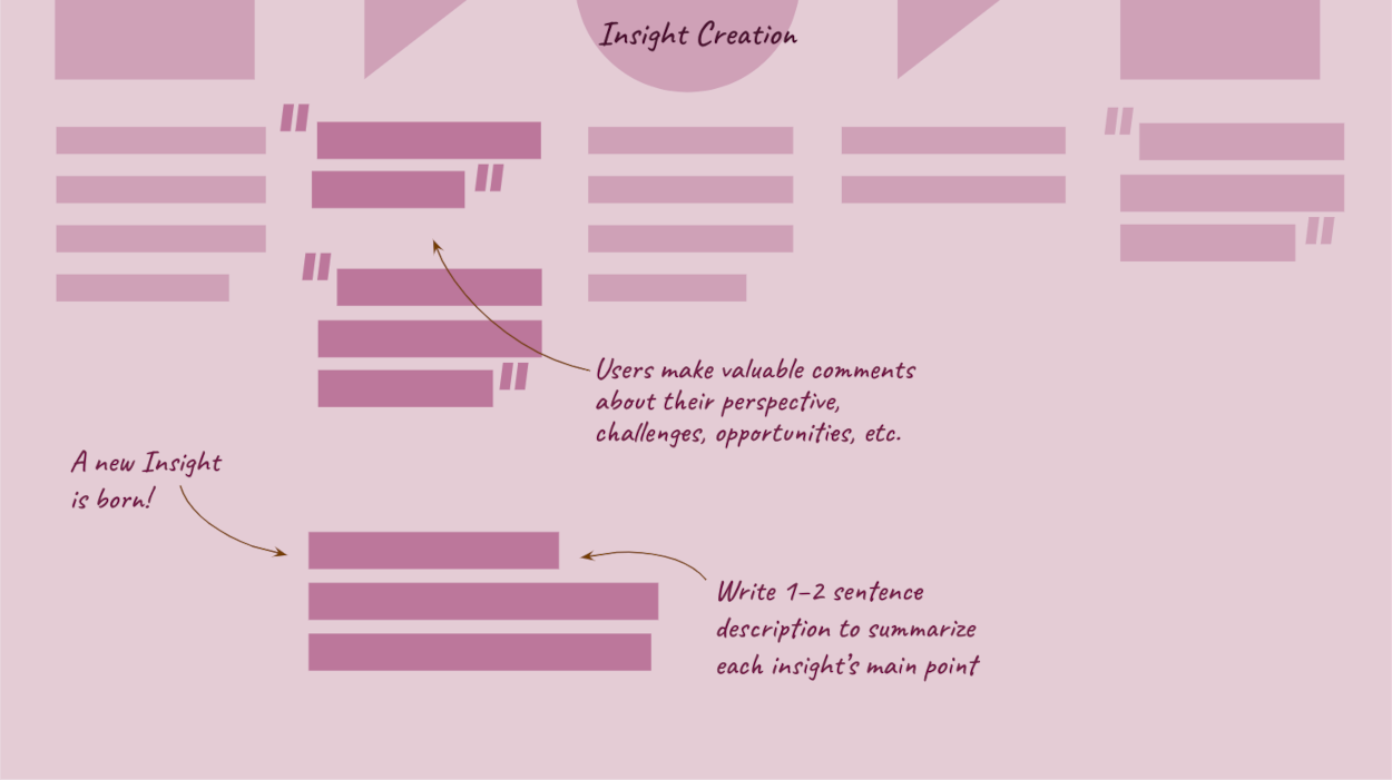
We define an insight as... a new piece of information that gives us a better understanding of the user, while providing an opportunity to do something about it. It's an a-ha! with an angle for the business to act upon. These a-ha's will be sprinkled throughout your analyzed user data. It's your job to pick ⛏️ and pull them all out, so that you can move into creating themes at a later stage. For now, we're content with amassing quality insights. Actually, quantity is what we're after as well. A high volume of valuable insights gives us ample substance with which to work.
Insights come from users saying, behaving, or implying that there's an opportunity to improve the UX.
You'll begin to annotate these moments within your analysis. We're watching for users' shared sentiment / actions about one of five things. It's insightful when users express:
Take a close look at all the italicized words. Challenge, confusion, improve, positives, recommendations and ideas... these are things we're looking for as UX researchers. Evidence of these are considered insights. We must ask ourselves, and our data, how can we reduce pain points and multiply points of positivity in the broader user experience. More specifically, whatever gives us a better sense for where, what, when, why, and how to do so is considered a valuable insight. Insights come from watching, listening, and learning how users are responding to the UX. Then, carefully documenting ✏️.
So far, we've covered what insights are, and from where they come, next we'll get into how to uncover them...
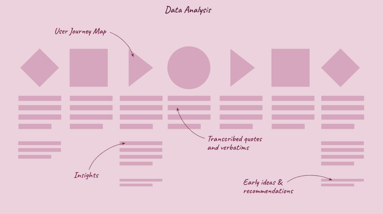
This list is by no means exhaustive. It's simply a top-12 catalog of some our go-to methods for Data Analysis. You don't need to use them all, just try out a few frameworks for size 👕 to see what works. Your approach may vary depending on the data to which you have access, and the type of user experience in scope. For instance, Human Factors lends itself best to physical products, while Journey Maps are regularly associated with digital services. Video editing is handy for evaluative research, while Ecosystem Mapping is usually reserved for generative research projects. And so on.
In the following section, we'll break down each of the 12 frameworks to assist in Data Analysis, and provide more context into each.
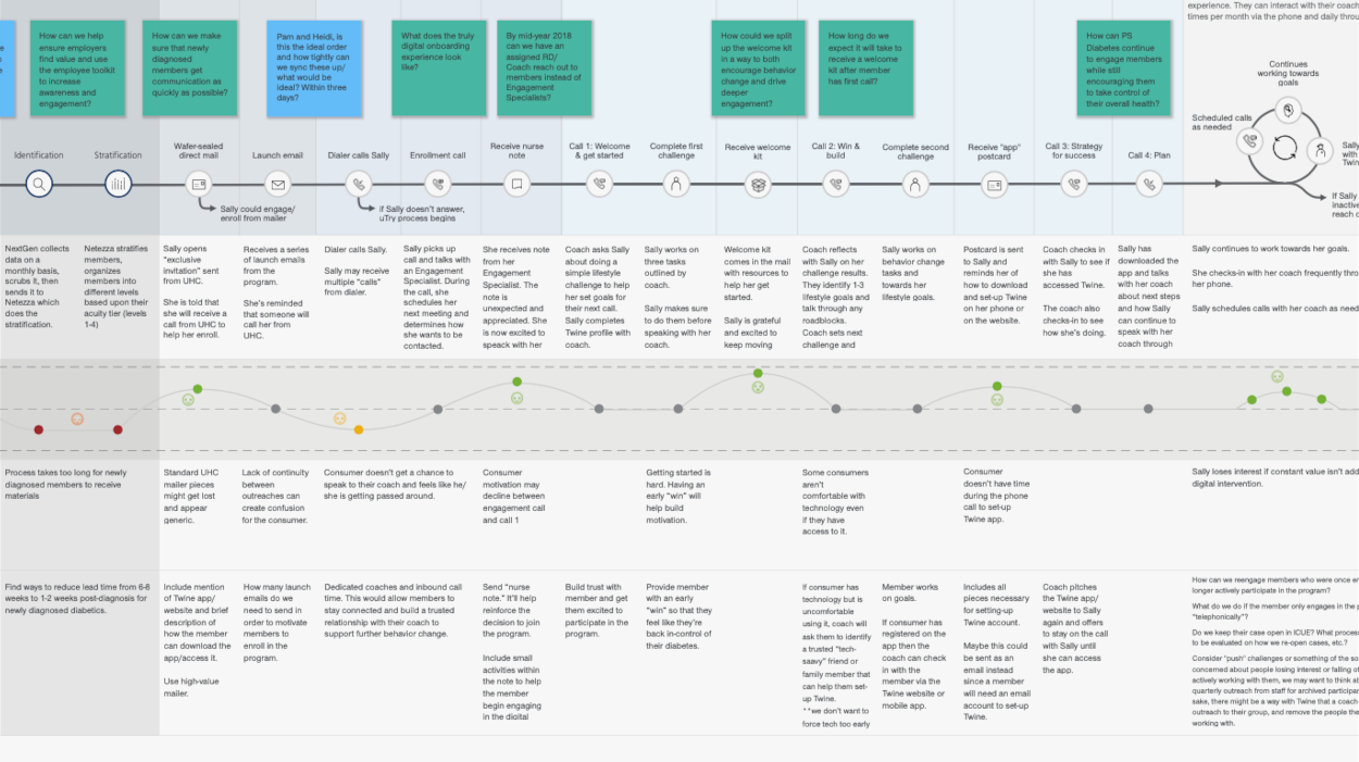
The almighty Journey Map... It's at the top of the list for a reason. So versatile, yet simple. The User Journey Map is a mainstay in the majority of UXR projects. Whether you're mapping something simple or complex, the Journey Map will give you a basic structure for all to follow.
Journey Maps are useful since they offer infinite flexibility of swimlanes and columns in which to enter your raw data. Furthermore, the 5E's — Entice, Enter, Engage, Exit, Extend — pushes you to address more outside the narrowly-focused user experience as defined by most teams. With Journey Maps, you can choose to map the user interactions with the product specifically, or map the broader life journey of the user and how that intersects with the product(s) and touchpoints.
Journey Mapping tips include: start simple with a spreadsheet or sticky notes. Both provide the form factor required to get started — blank boxes to fill with data, and then rearrange accordingly. Additionally, keep a version handy while interviewing or still in data collection mode. You'll be able to fill in key quotes, early ideas, and nascent insights as you go.
Return to overview ⤴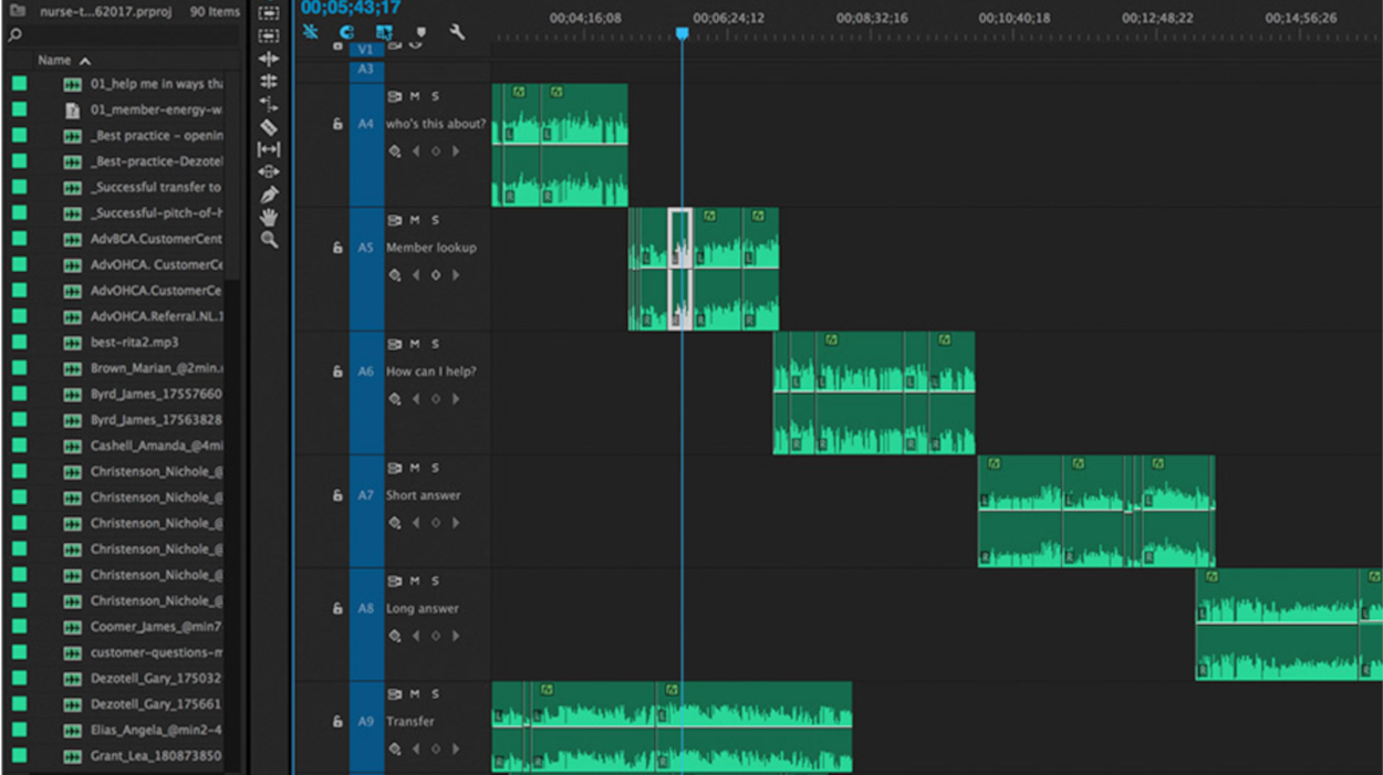
Video editing tops our list as a favorite analysis methods. It ranks near the top because you can move from analysis to synthesis in the same platform. You'll be dealing with the raw data the whole time (video of the user), but systematically moving around to form insights, and then themes, by way of clipping, coding, and stitching.
Choose from programs such as Adobe Premiere Pro, Apple iMovie, or other. These video editing software actually contain more functionality than typically necessary for UXR data analysis. Common tools within include: "scissors" for clipping out highlights... and that's about it! Use swimlanes, color coding, and labeling to your advantage in order to keep thoughts straight.
Video editing tips include: make sure to save versions as you go. Since you'll move from analysis to synthesis in the same file, you'll want to be sure to retain key steps as separate files. Save as, "file_name_V1", "file_name_V2", "...V3", etc. is your fiend 😊.
Return to overview ⤴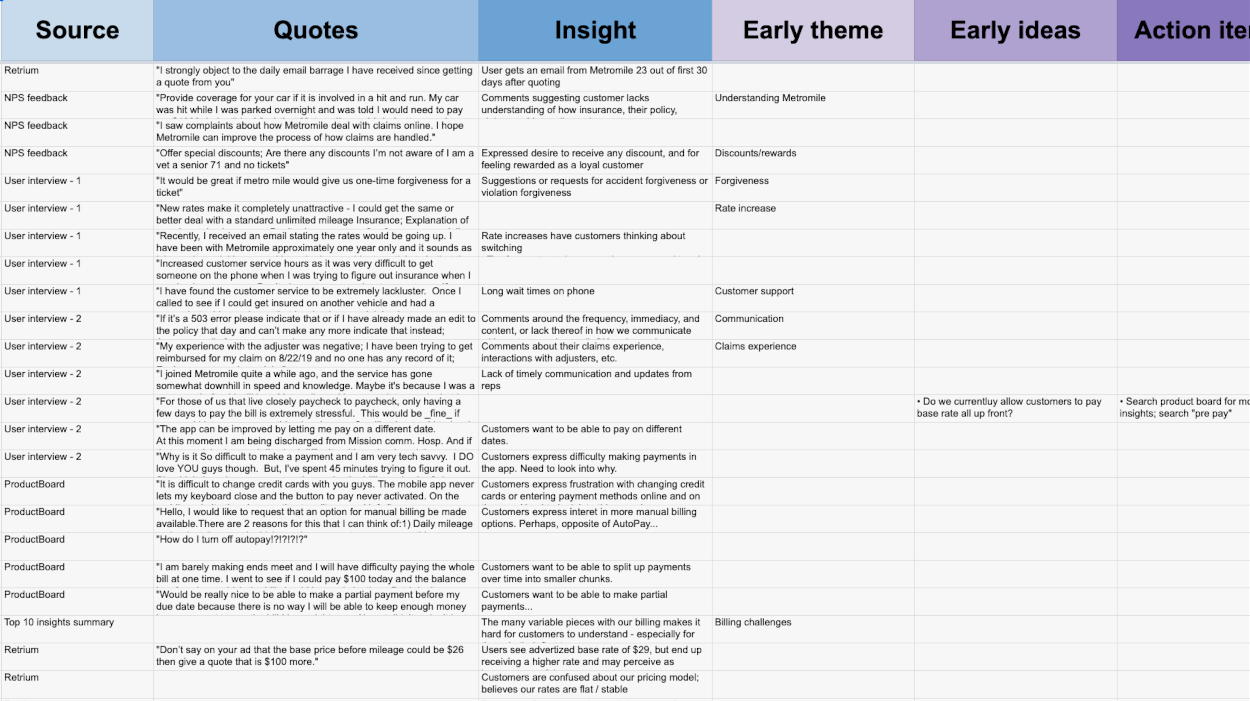
An interview transcript spreadsheet is another super simple, yet highly productive framework. No need to get fancy here. Actually, most of what we have to say are tips below. A testament to its versatility and practicality.
Label your columns as shown in the image above, and start filling in the user data. In this analysis phase, most of your entry will stay focused on the 'Quotes' column. That's cool. Not everything is insightful at this stage. Simply document the user's perspective in their own words.
Transcription spreadsheet tips include: Use ellipses when transcribing user quotes to speed up the process. Cut out commentary you know is not relevant, or doesn't add additional color (i.e. filler words and phrases). Additionally, use the same spreadsheet for all sessions. Create a new 'tab' for each participant, observation, etc. This keeps all the raw data in one nice, neat place. Also, re-size your rows to be two-lines high, with the remainder of text wrapped and hidden. This keeps the spreadsheet approachable. Lastly, audio record your interviews when they take place so you don't have to enter the data real time. This equates to more work later, but much more attention can be focused on the task-at-hand.
Return to overview ⤴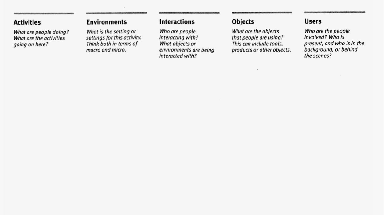
AEIOU — Activities, Environment, Interactions, Objects, Users — can be used as a framework during or after interviews and observations. It's also a useful tool to give non-experienced stakeholders in the field with you. It gives them a sense for things for which to look.
This is a good framework for organizing lots of data as a first pass. It gives you a structure to enter your data accordingly. Add to it during user interviews or as a fast-follow to record key-takeaways. The goal is to exhaustively document all available data about a situation. Breaking everything down now will result in better building blocks later.
AEIOU tips include: print out several sheets with the framework outlined. Use one sheet per interview / observation / inquiry etc. This acts a valuable repository and summary for each session, since they all tend to blend together after the fact. Add a 'Quotes' column as well, if you'd like to document verbatim as you go. Actually, this can often be the most robust column from each session.
Return to overview ⤴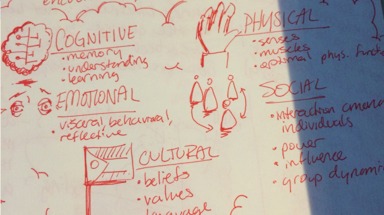
The 5 Human Factors has been a staple in design and engineering fields for decades. An 'original gangster' of user experience research and user-centered design, if you will. It works so well as an analysis framework because it encompasses a full picture of the user experience. It emphasizes the need to look at how design factors into the physical, cognitive, emotional, social, and cultural aspects of a user's life.
This framework allows you to examine multiple angles simultaneously during research sessions, and after. You'll quickly realize if your over-emphasizing one area when there's much more data being filled in vs. other areas. This helps you refocus your attention and research questions to make sure you're more well-rounded in the approach. While the 5HF's were originally best suited for physical products, the framework still works well for touchpoint analysis of omni-channel experiences. Especially, when you're assessing how the full system operates.
5 Human Factors tips include: leverage the framework in the research planning stages as well. Doing so helps to provide an useful outline for research questions and objectives. It also give partner stakeholders a structured way to ideate new questions they might not have otherwise.
Return to overview ⤴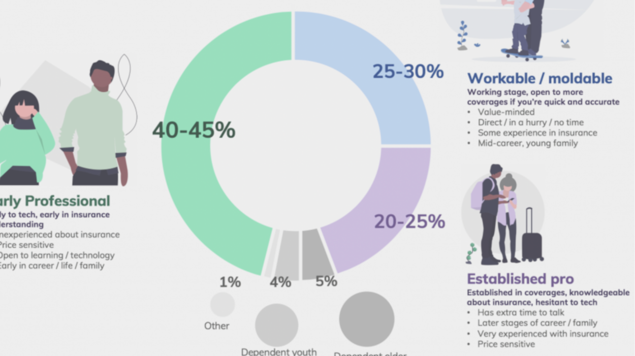
While not expressly an analysis framework in the traditional sense, we made sure to include Excel pivot tables + graphs for pure usefulness. Many of the frameworks mentioned so far are qualitative in nature, while pivot tables are geared towards quantitative data analysis. And for any UX researcher, they're a quick and efficient way to perform statistical analysis on large samples of data.
Pivot tables in MS Excel give you the ability to analyze data sets by certain variables. You're able to look for themes, gaps, and trends in the data samples. The nice part is it's all very plug-and-play and the capability comes already built into Excel. No need for data science degrees, advanced software, or database coding skills. You just need the raw data set from surveys, user panels, or web analytics, etc.
Excel pivot tables and graphing tips include: combine the power of pivot tables with graphs and charts. Data visualization with graphical charting is an impactful way to communicate findings. It's surprising how aesthetically pleasing and informational the charts within Excel can be. Better yet, hand over your version_1 to a more advanced professional and have them dig deeper into the analysis (data scientist), or better visualize the outcomes (designer).
Return to overview ⤴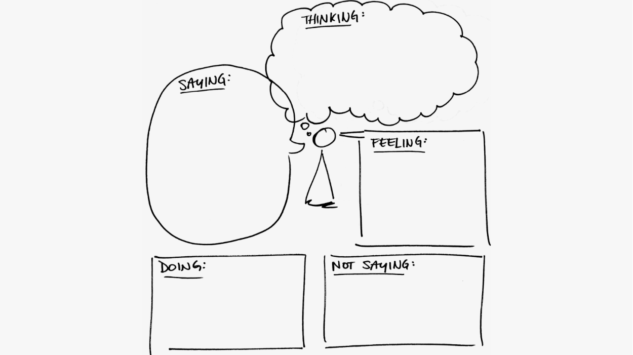
Users are complicated beings. Turns out they have a lot of thoughts, feeling, and behaviors that are not easily explainable. Unless, you have a great framework such as the Empathy Map to see it all in plain sight.
So simple, yet comprehensive, a completed Empathy Map gives others a stereo picture into the minds of the users. Meanwhile, Empathy Maps provide UXRr's a solid footing on which to pull apart their data. It helps to get into some of the deeper questions and answers lying behind the users' straightforward commentary. The Empathy Map gives researchers a chance to dig into the 5-Why's.
Empathy Map tips include: try it out as an analysis tool yourself on projects, or leverage it during stakeholder workshops. Have your workshop participants flex this framework to build their own empathy with the end-users. Print it out on large format paper (24" x 36"), share some user stories, and set your participants loose with sticky notes 📝.
Return to overview ⤴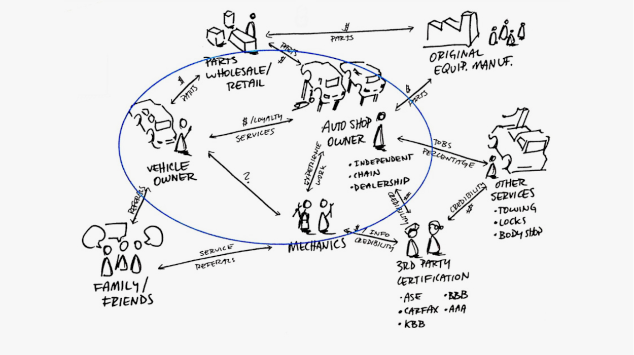
Zoom out one time from the user perspective, and take a look around at the other stakeholder interactions. The Stakeholder Map gives you a way to analyze who everyone is, and their roles. This framework is useful to show relationships, power dynamics, and influences. Analyze your user data while beginning to visualize it as well, using this tool.
Stakeholder Maps are most useful in complicated user experiences, with lots of actors at play. Use the map before, during, and after research sessions to make sense of everything going on, and how it's all related. While always daunting to begin analysis of a complex system, this map helps to guide the process. Plus, they make great complimentary project deliverables.
Stakeholder Map tips include: put early versions of your Stakeholder Map in front of users during interviews, panel surveys, focus groups, etc. Give others a chance to do your analysis work for you! With something tangible in-hand, your users can help to document more, and fill in the rest.
Return to overview ⤴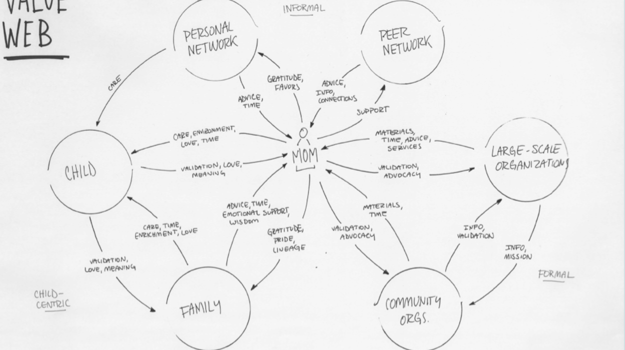
Zoom out again, and you're looking at the broader UX ecosystem. Ecosystem Maps are a useful framework when dealing with highly complicated systems and networks. Think financial systems, healthcare industry, insurance networks, and more. Ecosystem Maps are a great build-it-as-you-go analysis tool. Rarely will everything come into focus in your first go around. Keep your Ecosystem Map close by. Show it to users, stakeholders, experts, etc. to keep iterating on it, and filling in additional nuance.
Ecosystem Maps can be broken down into entities and value exchanges. You'll use your research methods to identify all the relevant entities of the network. The exchanges of value (information, time, energy, money, goods, services, etc.) are the connectors between the entities. Use the map develop new research questions, and fill in the details as more insight emerges.
Ecosystem Map tips include: get detailed in the analysis of the flow of value exchanges (information, time, money, etc.). Use different color arrows to identify each value and direction of exchange. This framework is also an effective workshop facilitation tool to establish initial context for teams. Best when printed out in large format 📜.
Return to overview ⤴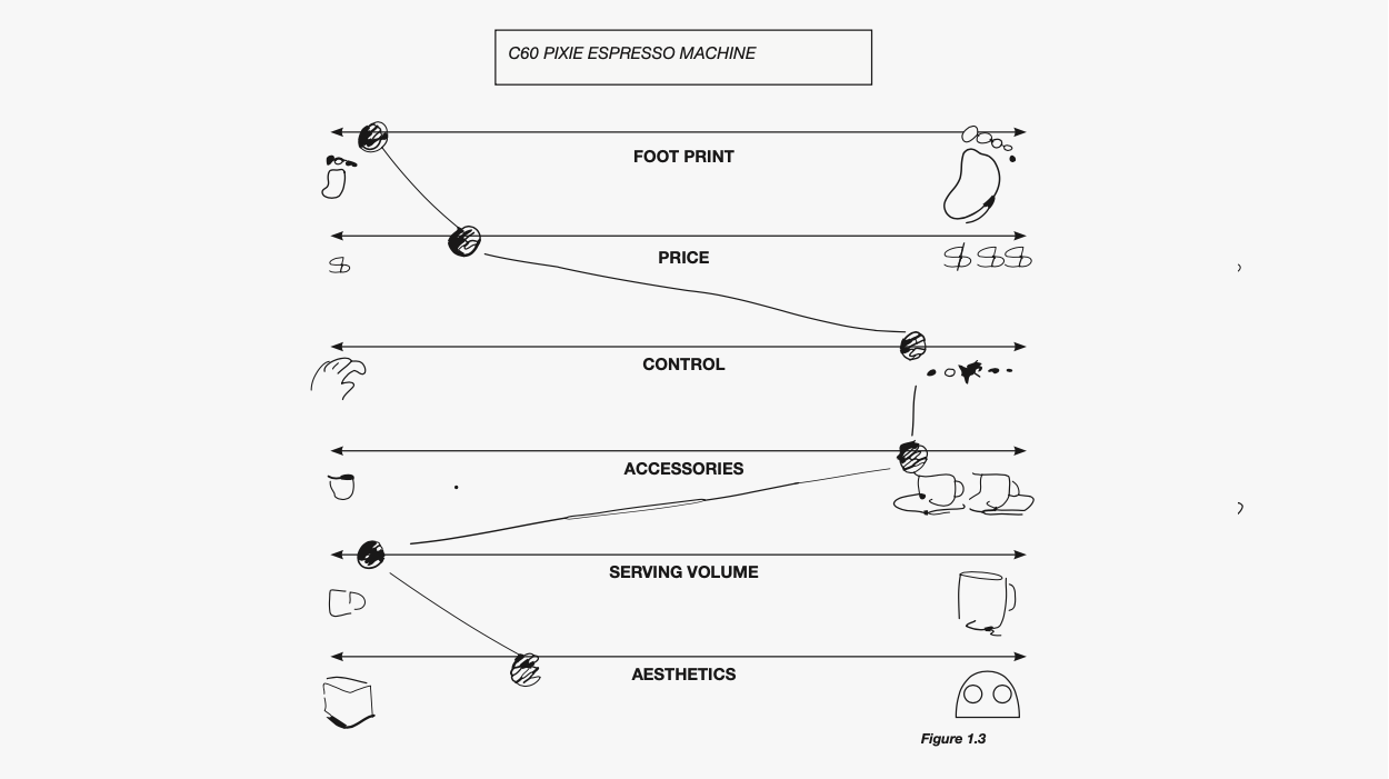
The Semantic Profile framework is all about the making sense of products and/or users. The purpose of the tool is to pull / push apart the subject in question in various ways. Raw data going into this tool will help you determine the spectrums, as well as who/what is at which point along the axiis.
The framework acts like a series of dials. Based on what you're learning from the research, you'll be able to dial in 4–7 different user or product snapshots. The visual nature of the spectrums helps stakeholders easily differentiate amongst the subjects at a glance.
Semantic Profile tips include: choose between 5–8 spectrums from your early research data analysis. You shouldn't have too many spectrums that it becomes cumbersome to understand in a few seconds. And too few won't provide enough options for breadth of profiles.
Return to overview ⤴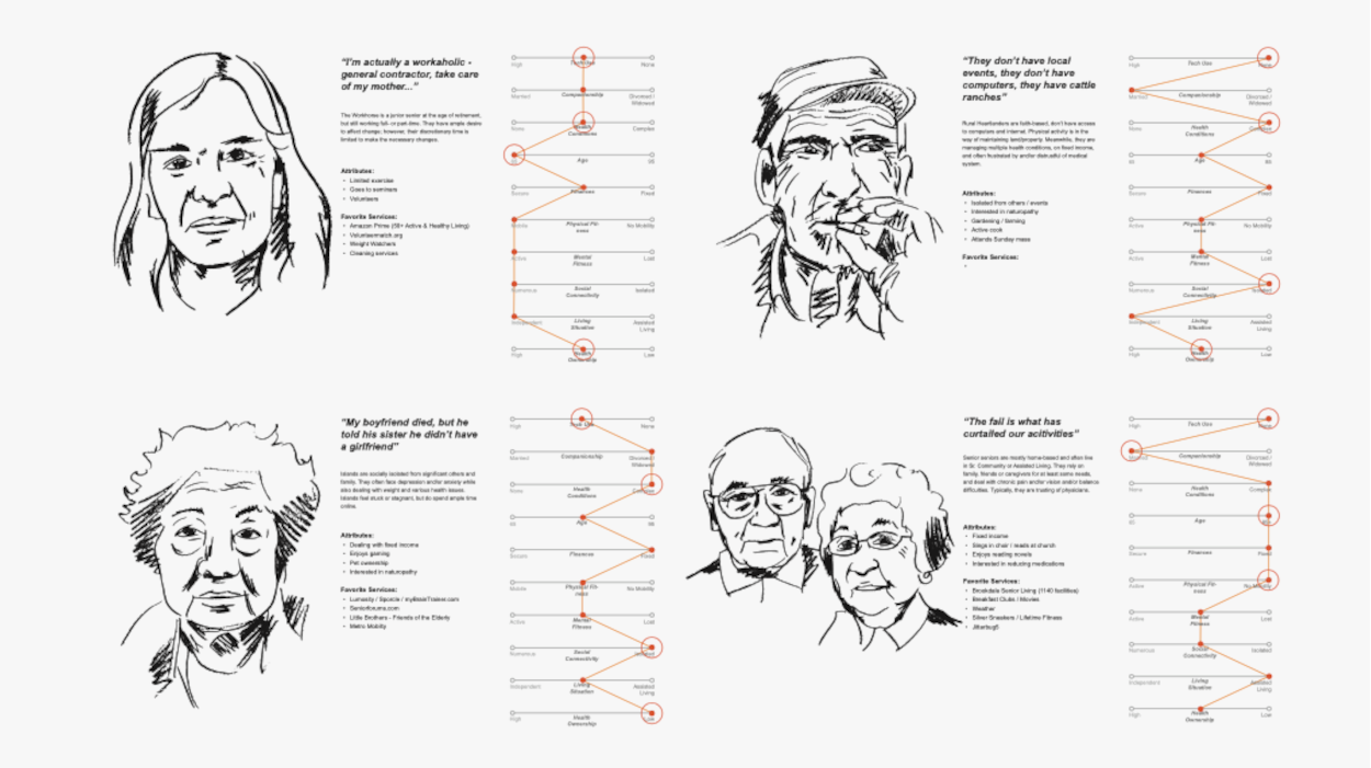
User personas, user types, user profiles, user archetypes, etc. are all different phrases for the same thing. This framework of analysis is meant to generalize users into different buckets. Doing so help stakeholders wrap their arms around the majority of user types, and how they might generally behave.
In addition to Journey Maps, User Personas are a quintessential tool in every UX researchers' belt. They're highly effective in simplifying and categorizing insights from research studies. Useful both as an analysis tool and as a key deliverable to your teams, User Personas punch above their weight class.
User Personas tips include: Mix qualitative with quantitative insights for maximum impact. Leverage internal data science teams before, during or after the development of User Personas to add an additional statistical layer to your analysis. The quantitative overlay helps with figuring out relative sizing of different qualitative user types. Quant data is especially useful when formulating strategies for marketing, UX, engineering, design, operations, and more.
Return to overview ⤴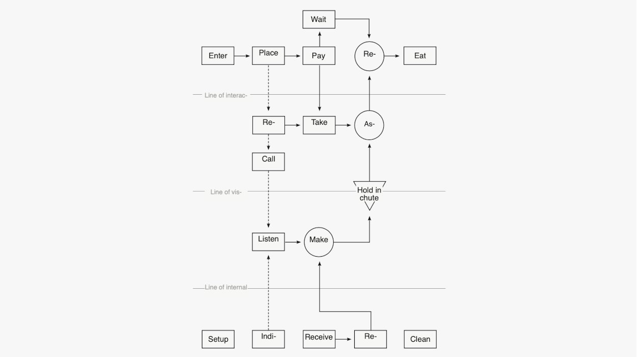 `
`
Service Blueprints are Journey Maps on steroids. Blueprints map the user journey, in addition to what's happening behind the scenes, as well as outlining what's involved in background processes. The 3 distinguishing lines are 'line of interaction', 'line of visibility', and 'line of internal systems'. Within each, an operational process mapping of key entities, actions, flows, and exchanges take place.
This framework helps to facilitate both internal and external conversations when it comes to research. In larger, complex products, figuring how who does what, when, and how is no simple task. The user journey may be as convoluted as the processes that work together (or don't) to make it happen. To make a true difference, a researcher must analyze and derive insight into the inner workings of a product's user experience, just as much as the external touchpoints. Especially, when internal delivery teams are separate, without extensive communication or knowledge about one another.
Service Blueprint tips include: take an example from operations process mapping tools and techniques. Leverage industry standards for how to designate activities using specific shapes (circle, square, diamond, etc.), as well as for flows and exchanges. Draw.io, LucidChart, Creately, and other operations process mapping / flowcharts can be referenced, or used entirely.
Return to overview ⤴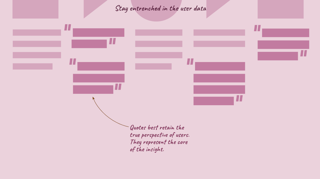
As a UX researcher you need to keep an open mind throughout the Data Analysis phase. Other stakeholders — and you yourself later in the project — will develop stern perspectives about various topics. Shall we say, jump to conclusions. That's perfectly acceptable, but now is not the time. We need to stay unbiased, and let the data speak for itself. Give the data room to breathe, settle, and naturally filter itself. If you don't stand back now (you definitely won't later) there's a greater possibility you'll miss something very important. So just chill 🥶.
User quotes are one of the most effective ways to normalize all of our data, without imposing our 2-cents. That's because we're not summarizing, paraphrasing, or anything of the like. We're simply documenting what the users said, and how.
Don't be afraid to temporarily lose sight of some of those great early ideas or insights you've come across already. User quotes 💬 do an excellent job of retaining the core meaning of a user's perspective, with subsequent insights / ideas. When you spend the time to transcribe, and stay entrenched in the user quotes, all else will follow. If you can't use quotes, because perhaps you didn't do interviews, keep everything at the basic fact or stat level. The point is to refrain from summarizing too early.
Don't worry. By staying entrenched in the data, via user quotes / facts / stats, you'll be letting the data work for you. It'll start to surface topics that resonate, repeat, and reside amongst many of the users. No matter what, you'll very quickly be moving into the next step anyways, where you'll be notating insights, early ideas, and recommendations. Thanks for momentarily curbing your sense-making 🤔.
Back to top ⤴
Work smarter, not harder.
The Turbo UXR Playbook is your tactical reference 👇 guide — free to download!
Get the Playbook
Learn More